예제2)
| 속성 | 설명 | 주요 값 | 코드 예시 |
| display | Flexbox를 적용하려면 반드시 선언해야 함 | flex | display: flex; |
| flex-direction | 주축의 방향 설정 | row, column | flex-direction: row; |
| justify-content | 주축 방향 정렬 (가로 정렬) | flex-start, center, space-between 등 | justify-content: center; |
| align-items | 교차축 방향 정렬 (세로 정렬) | stretch, center, flex-start 등 | align-items: center; |
| flex-wrap | 화면 공간 부족 시 줄바꿈 여부 | nowrap, wrap | flex-wrap: wrap; |
| flex-basis | 기본 크기 설정 | 예: 150px | flex-basis: 150px; |
| flex-grow | 여유 공간 비율 설정 | 0, 1, 2, ... | flex-grow: 1; |
| flex-shrink | 축소 비율 설정 | 0, 1, 2, ... | flex-shrink: 1; |
<!DOCTYPE html>
<html lang="en">
  <head>
    <meta charset="UTF-8" />
    <meta name="viewport" content="width=device-width, initial-scale=1.0" />
    <title>Document</title>
  </head>
  <body>
    <div class="container row">
      <div class="one">one</div>
      <div class="two">two</div>
      <div class="three">three</div>
    </div>
    <div class="container column">
      <div class="one">one</div>
      <div class="two">two</div>
      <div class="three">three</div>
    </div>

    <style>
      .container {
        /* 초기 flex선언을 해줘야 아래 플렉스 동작함 */
        display: flex;
        border: 10px solid red;
        margin: 10px;
        height: 300px;
        /* justify-content:center;
        align-items:center; */
        flex-wrap: wrap; /*화면이 부족하면 줄바꿈*/
      }
      .row {
        flex-direction: row;
      }
      .column {
        flex-direction: column;
      }
      .one {
        border: 10px solid blue;
        /* flex-basis: 30px; */
        /* flex-grow: 0; */
        /* flex-shrink: 0; */
      }

      .two {
        border: 10px solid green;
        /* flex-basis: 60px; */
        /* flex-grow: 0; */
        /* flex-shrink: 0; */

      }
      .three {
        border: 10px solid pink;
        /* flex-basis: 150px; */
        /* flex-grow: 1; -나머지 여백을 3가 다가져가- */
        /* flex-shrink: 1; -부족한 여백이 있을때 얘를 아래나 옆으로- */
      }
    </style>
  </body>
</html>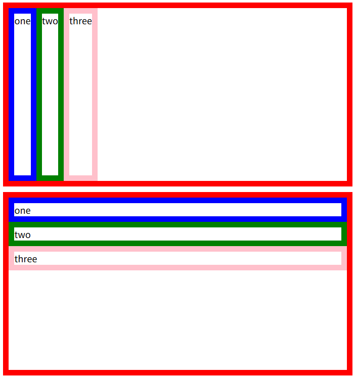
예제1)
ol , article과의 차이
display:flex 플렉스의 시작
flex-wrap: wrap,no-wrap 자리 없을떄 줄바꿈
flex-basis: -px 고정
flex-grow:1,0남은여백처리
flex-shrink:1,0부족한여백처리
justify-content:기본축 정렬 start,end,space-around
align-items:교차축 정렬 start,end,space-around
height(높이),margin(마진): 태그별 flex-basis가 다르게 적용되있을때 고정값으로 정해주는 것
<!DOCTYPE html>
<html lang="en">
<head>
    <meta charset="UTF-8">
    <title>Document</title>
</head>
<style>
    .container{
        display: flex;
        border: 10px dashed red;
        justify-content:space-around;
        height: 600px;

    }
    ol{
        flex-basis: 100px;
    }
    article{
        flex-basis: 200px;
    }
    ol,article{
        border: 10px solid blue;
        margin: 50px;
    }

</style>
<body>
<div class="container">
    <ol>
        <li>html</li>
        <li>css</li>
        <li>js</li>
    </ol>
    <article>자 이제 시작이야 내 꿈은 내 꿈을 위한 여행 핏카츄! 걱정 따윈 없어 없어 내 친구와 함께니깐</article>
</div>
</body>
</html>
2.
'Code🦜 > HTML,CSS,JS' 카테고리의 다른 글
| 폰트 렌더링이 되고 있지 않은 상태 -해결 (0) | 2025.04.15 |
|---|---|
| 인접 형제 선택자 (0) | 2025.03.17 |
| 줄간격 초기화 (0) | 2025.03.17 |
| 부모가 flex라면 자식이 인라인요소여도 width 가능 (0) | 2025.03.17 |
| 퇴근후 공부) HTML테이블 만들기 (0) | 2025.03.13 |


